I am pretty behind in sharing our recent photography work. I apologize about that. I hope this special post helps make up for it. I wanted to show you an adorable photo shoot I did with two beautiful little girls, we themed A Sweet Christmas.
I have done a photo shoot for Christmas with these sweet little girls every year, for the past 3 years. When their mom first contacted me for our first consultation in 2007, I was ecstatic. I knew the last name, because the husband has an established business in town. So I was interested to find out what she was looking for.
We clicked immediately, and have been the best collaborative team, every since. She has excellent taste, and a real appreciation for creative, custom and quality work. I would offer nothing less, and I have pretty high standards for my own work. ; ) What she really wants every year, is photos of her girls, and a one-of-a-kind Christmas card, using them. She has a real flair for style, and is not a fan of the ‘traditional Christmas elements’, like everything red & green, etc. (Neither am I.) Although they do go to my church, so they are not that far from traditional Christmas. ; ) So anyway, it is one of my big creative gigs I take on every year, because the mom/my client leaves the whole planning up to me, from beginning to end!
We usually meet in the fall for a consult, and by then I’ve usually brainstormed an idea, and she is always thrilled with it! I pitch to her what I have envisioned. She gets anything we need for the photo shoot, such as particular clothing for the girls, etc. Once the photo shoot is done, I allow her so many photos to choose for me to work with, and then I completely custom design their whole Christmas card. She always places a big order for not only the Christmas cards I designed, but lots of prints of the photos I took. So all of my efforts are well worth it, in the end.
It’s a really FUN project for me, because she not only gives me SO much creative freedom, from planning the photo-shoot that involves where we will shoot, what the girls will wear, and the kind of shots I want, to designing the whole card. But also because she APPRECIATES all of it so much! She gets SO excited when her cards, envelopes and photos are in. Giddy, even. It’s really nice to have someone appreciate your creativity on that level. And I love seeing and working with the girls and their mom, every year.
This year, our 3rd working together (2009), was the first year I planned their photo-shoot in my studio. I had such ‘visions’ in my head, and even had a general idea of how I wanted to design the card, all before our consult took place, and photographed the girls. So I was thrilled that once again, the mom was on board with my idea. The theme this year, was candy/sweets; a sweet Christmas. I had the mom looking for big swirly pops, but all she ended up finding was these marshmallow pops, which ended up being so much fun!
Just to let you know, I never use the names of children I work with on the net. Or last names. And I apologize for the watermark I have to splash across the images, but it’s important when putting images on the internet. So, just try to block out the watermark and see the image for what it is. Naturally, the watermarks across the middle are not really part of the image.
So first I’ll show you the images my client chose to work with, and then I’ll show you the card I designed for her.
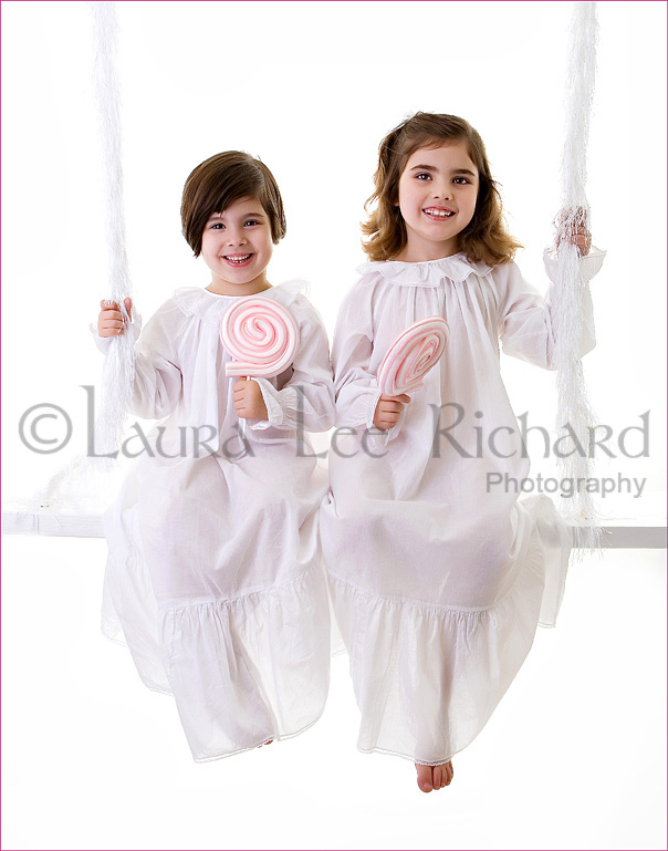 Here are the girls, on my ‘swing’ in my studio, in their white nighties their mom bought just for this shoot.
They are 4 years old and 6 years old now.
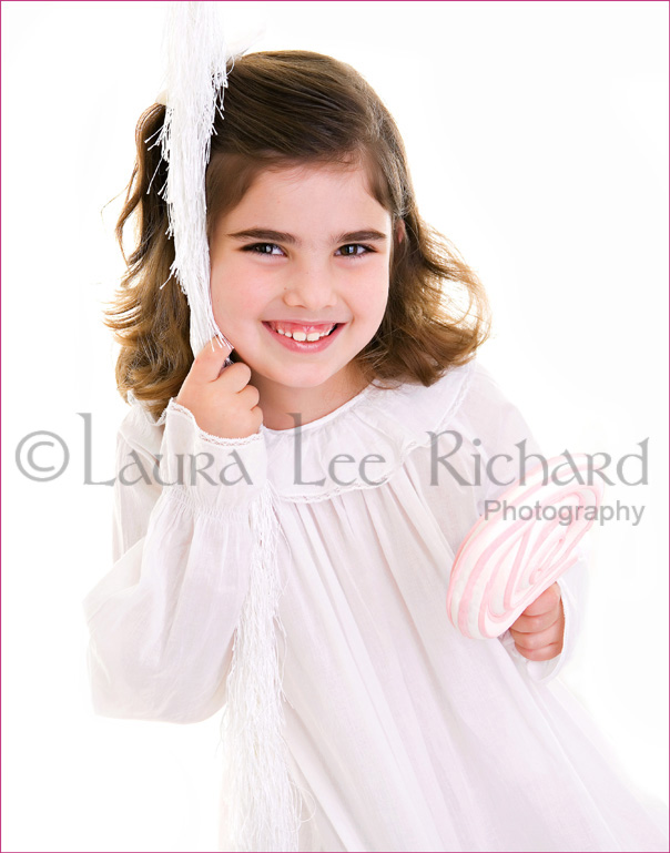 This is the oldest girl. She is so polite, very co-operative, and such a darling.
She has grown so much in the past 3 years, and is quite the little lady now.
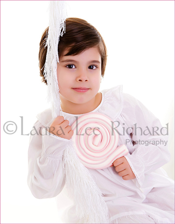 Her little sister, is a real spit-fire! What a doll, huh? She gave me a run for my money the first year I worked with her, when she was 2 years old!! But I don’t quit easily, and it sure paid off that first year. I know how to work with kids, if I do say so myself. Sometimes, it just takes time and patience, all of which I needed that first year. But when I want the shots, I’m going to get them. ; ) This year, now that the girls are that much older, they were both a dream to work with.
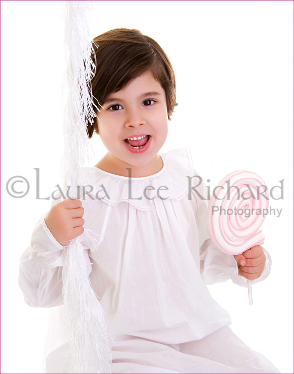 I love this photo, and I love the memory of taking it. Her and I were belting out the song, ‘Party in the U.S.A.’. It was hilarious, because you know how kids think certain words in a song are something other than they really are? Because that’s what they think they are hearing?? Well, we were singing, and she’s telling me, “No no….that’s not how it goes. It goes like this….“. <She sings.> I was cracking up. Her mom was shocked I knew the song so well. lol
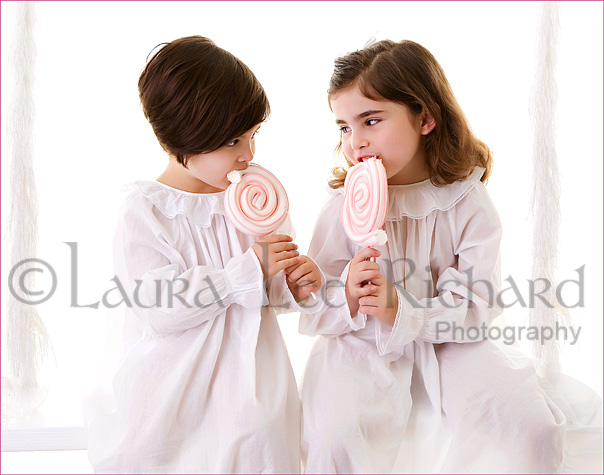 I took lots of shots, most especially because I was having so much fun taking them, and being with these girls. So it was really hard to narrow down what we had, and choose what we were going to use for the card. There were several we just HAD to use. So once we figured that out, I got to designing the card, that was in my head.
 I started with designing ‘digital paper’, or a background to work with.
I was definitely stuck on using pink this year. I also knew I wanted to incorporate candy in the design.

So I ended up sketching out candy/sweets on paper, and refining the drawings with a sharp black marker pen. Then I scanned them into my computer, and made them into digital brushes, to be able to work with them.
Here is the front of the card . . . .
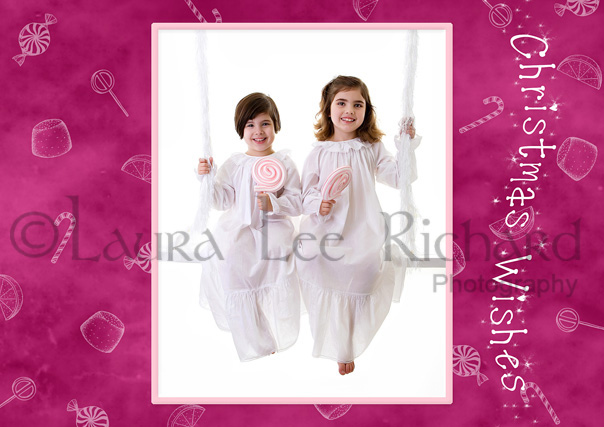 This is how the front of the card came out. It’s 5×7, with the fold at the top.
It opens up to this . . . .
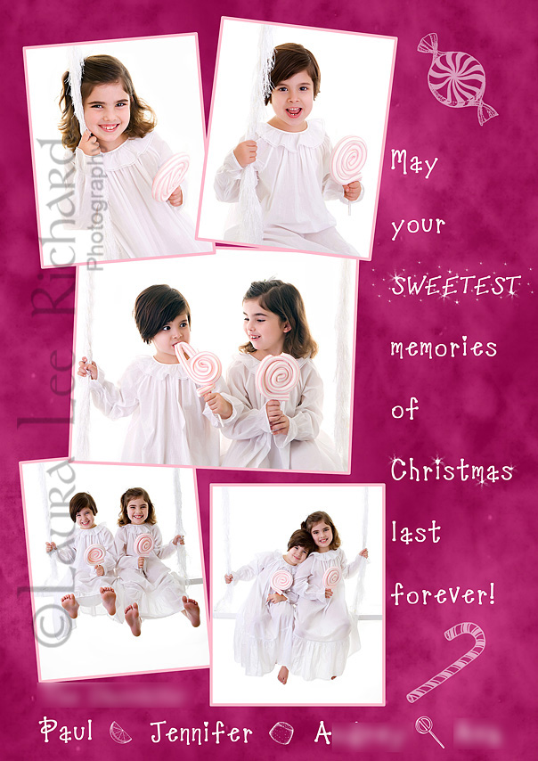 This is the spread inside, when opened. As you can see, I was determined to use several photos!! Check out the middle photo–I thought it was so funny!! Their expressions are a hoot! I really wanted to use the photos that showed their fun side, and personalities the most, because in the past, the cards I had done were very different from each other, but both very classic in style. Here, I did blur their last family name, and the girls’ names, on the card for privacy sake on the internet. But I loved the little piece of candy I put in between each name along the bottom of the card.
And the back of the card, is sometimes my favorite part . . . .
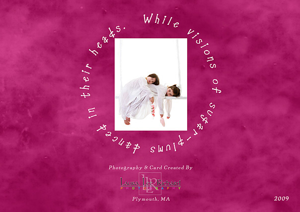
I always do something fun on the back, for this client. The mom is also really nice about letting me brand myself/my work on the back of their cards, however I want to. All of my work is branded, but I go a little bigger on these, because I can, and because I’m so happy with them in the end. Another thing to note about this card in particular, is that although these images above are the images I sent to have the card printed, the actual card was printed in PEARL paper, with UV gloss. (Unlike how flat in color they look here. ) So, the entire card printed, has a real pretty pearl shimmer to it, when it’s in your hand, and then has a glossy coat over it. They feel so nice too! They were simply GORGEOUS. And for some reason, they actually smell sweet! Which is a nice and appropriate touch, for this design in particular.
If anyone would like to see the previous years Christmas card (2007 & 2008) for this family, I’d be happy to dig those up and share them too!! As I said, the creative freedom this client gives me, makes it all such a joy for me. I’m looking forward to next year, already.

