
Are you singing now? The title was a spin off of a song.
Well anyway . . . . . .
I’ve been in the company of professional sign makers / letterers, one way or another, for about 26 years now, and I guess it’s really worn off on me.
I really love the whole entire creative process of sign-making and lettering. What’s more, I simply love signs. Most especially signs in a home.
So many months ago now, I started making some fun signs (with a little side-kick help from Michael), for the purpose of home decor. I got so into it, that we started talking about opening an Etsy custom-order sign shop! I’ve gotten as far as naming our little sign shop, and designing a great logo for that division of business. But all else I’ve done about it, is make lots more signs. : ) And I’ve had a ball doing it! We may very well still open that Etsy shop at any time, if we find there is interest! But today, I just wanted to show you the signs I’ve made.
I have designed all of these myself, with the exception of two. I’ll tell you a little about each one as I go here.
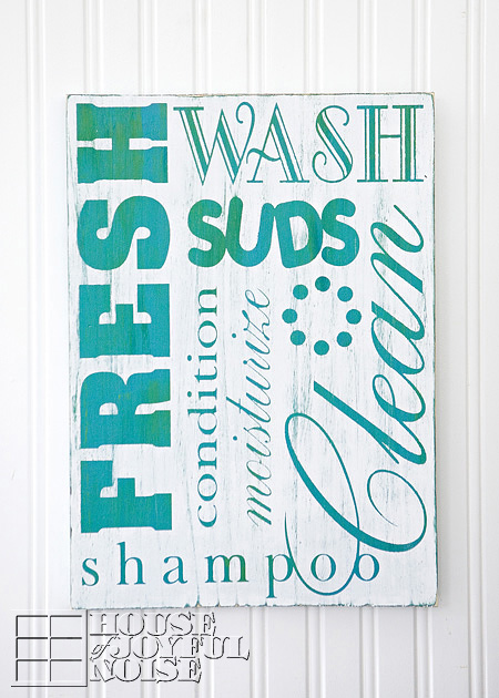
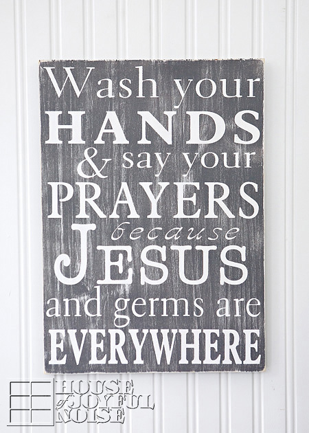
I wanted a couple of signs for our bathroom. I especially needed something for a tall narrow bead-board space in the little cubby area in our bathroom, over the floor-wall cabinet.
I wanted the sign to be along the theme of CLEAN: fresh water, suds and bubbles, etc. This sign is the result of that.
.
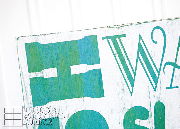 So far, my sign style is: worn, old and distressed. I just can’t NOT beat it up. I really love the look of ‘not new at all’.
.
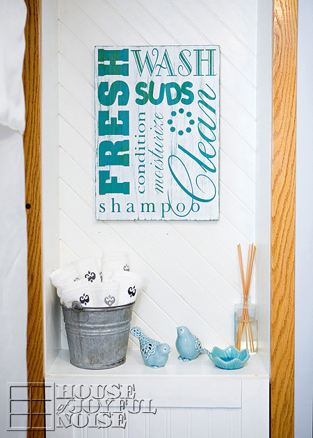
Here is it in the space it was designed for.
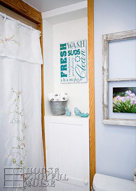
That cubby space over the cabinet was empty forever. I just could figure out what to put there.
But I finally got it together. The little ceramic birdies, and the old metal pale, really kicked the gears into motion, and the rest quickly fell into place. I think I’ll be happy with the decor of that area, for at least a little while.
By the way, I don’t know if the color of paint on our walls looks blue on your monitor, but it is actually a cool grey, on this side of the bathroom.
Our bathroom has two separate areas: sink and vanity area in one side, and toilet shower in the other.
.
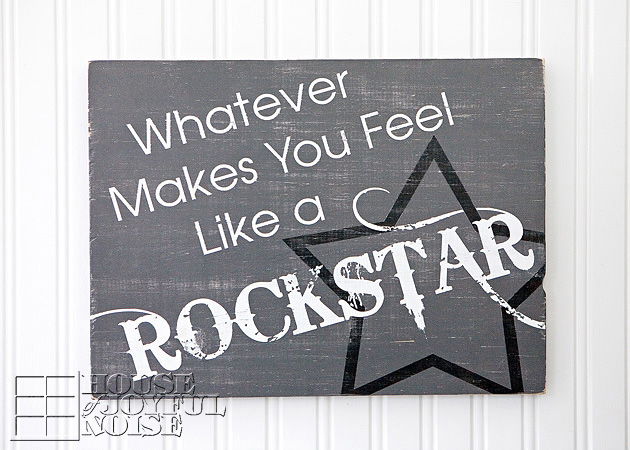
This sign, designed for my or any boys’ rooms, was inspired by a song. It was a lot of fun to design.
One of the many things I love about this particular design, is that the R at the beginning and end of ROCKSTAR wraps around onto the sides too.
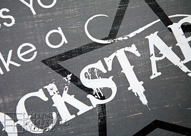
Simply put, I think the whole thing is cool.
I had a hard time choosing a color scheme, so I didn’t chose . . . . . .
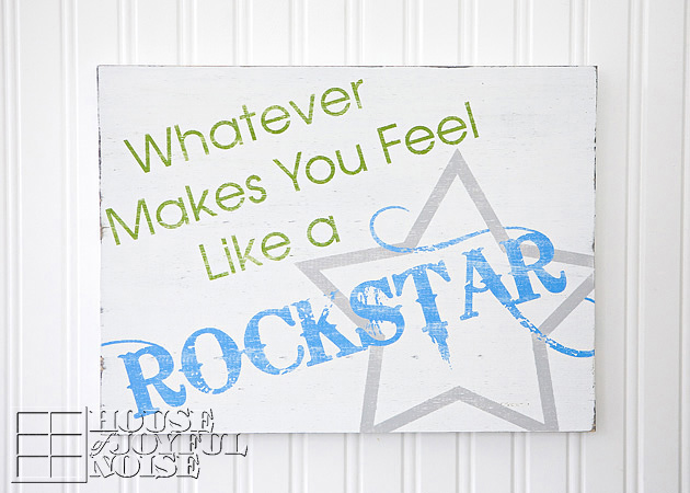
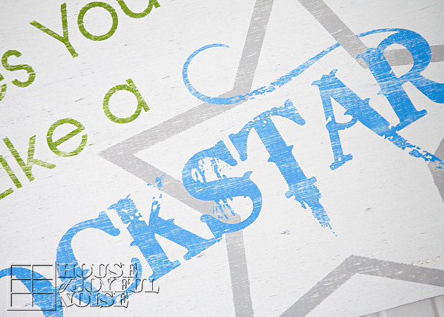
I just made both!
This sign is just plain good advice.
Yes?
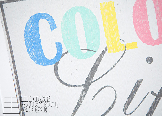
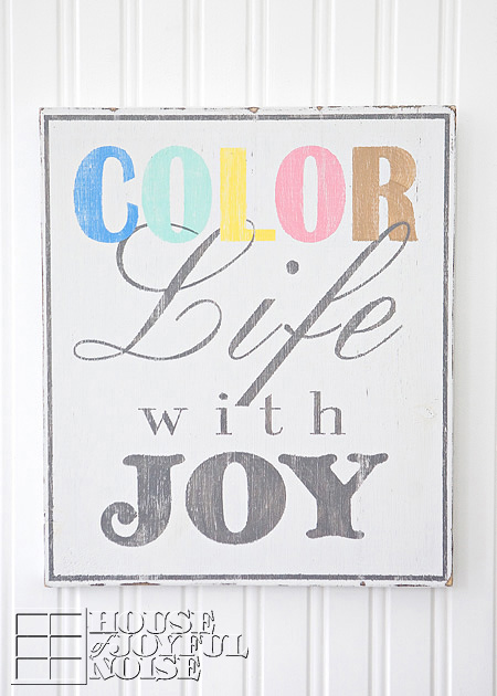
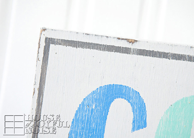
Most always when I get an idea for a sign, or anything else I make, the vision in my head is pretty clear in detail, and that means complete with colors.
So I most always just need to go with how I first ‘saw’ it, because nothing else seems right after that. This sign I saw with what I considered ‘beach’ colors.
So of course, I just went with it.
This whole sign, is not my own design or phrase at all. I have seen it many times, around the internet, and I wanted it for the other side of our downstairs bathroom! Of course, I could have bought the ones I saw. But that consideration is always immediately followed by the thought, “Why would I buy it, when I can just make it myself.” Had I bought it, I would have had it a lot sooner! Because while it was an immediate plan, it took me a lot longer to actually make it! While it’s not my own design, I do love it.
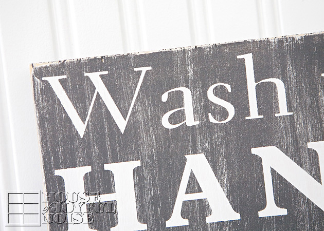
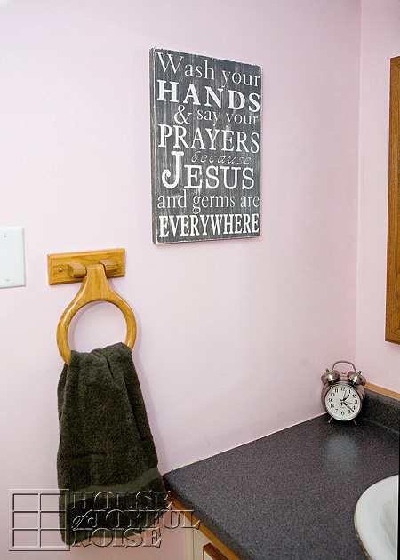
Here it is hanging in our bathroom in the sink/vanity area.
The wall paint color on this side is a pale pink, with a dark grey vanity and white sink.
So the sign colors I went with go perfectly in here. It makes me smile every time I see it.
This next one I made as a gift . . . . . .
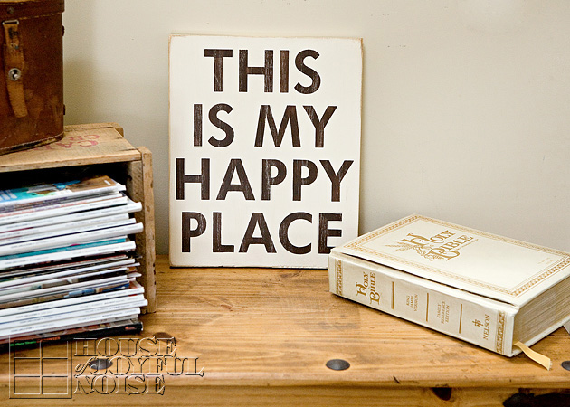
A blogger-friend I casually know, and whom I follow, one day posted a sign pretty much just like this one, and mentioned she wanted it for her home. I offered to make one just like it for her, (as best I could), simply because I like her. I’ve noted her kindness many times before, and just wanted to make it for her, because she wished for it. You could say it was one of those ‘Pay It Forward’ kind of moments. We have been blessed many, many (many) times, by gifts and other thoughtful acts of kindness by others. While it always fills us with such gratitude, for me, it doesn’t compare to the joyful feeling of giving to others. So I do give when I feel the want to do that. To me, it’s a gift to know I made someone happy, in any small way I can.
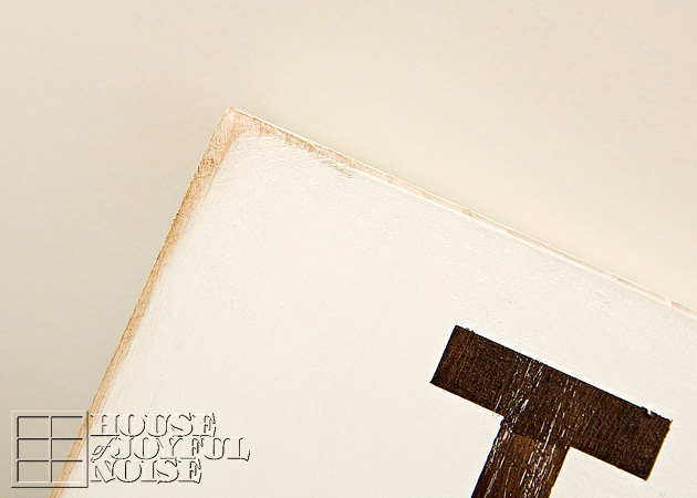 I actually tried to antique this sign some, with some dark wax along the distressed edges, to try and further age the look.
I hope I was successful.
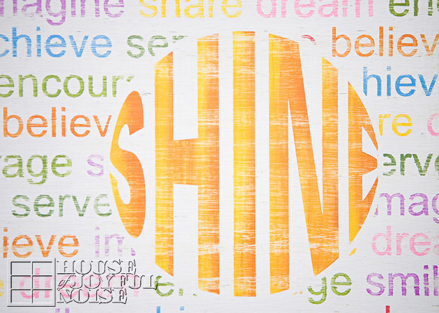
This last sign was inspired by my oldest daughter . . . . . .
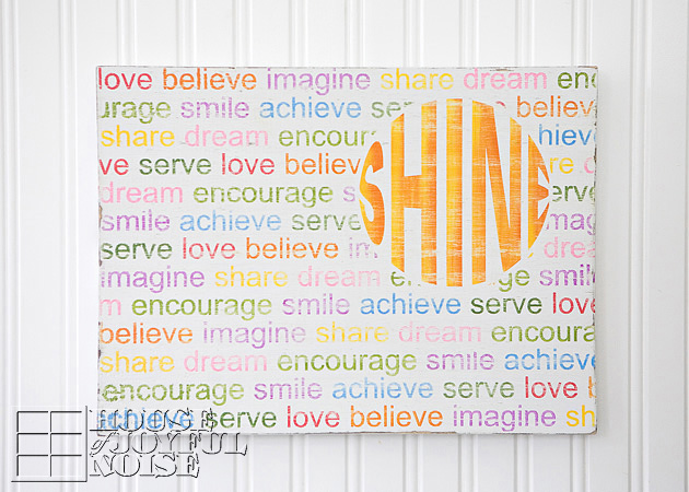
She really does SHINE, as that’s just her personality. It’s been a word that she has been described with by others, since she was a baby.
But also, ‘being a light for others’ has been a phrase I have grown her on.
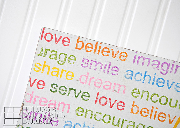 All of the ‘subliminal words’ are in essence, the very things I am trying to instill in her and all of my children, of course.
Wouldn’t you know, she fell in love with this sign . . . . . .
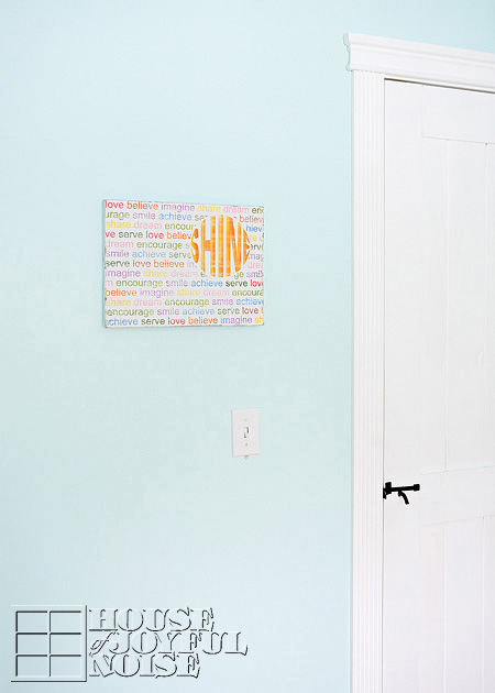
. . . . . . and asked to hang it in her room.
It really does seem in the right place, there.
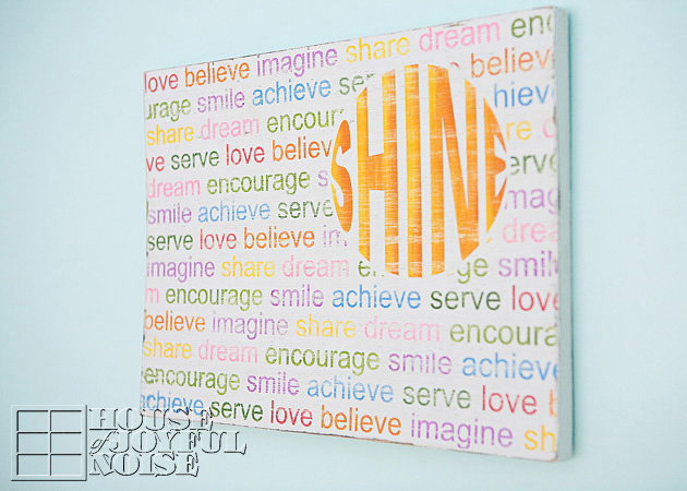
This one was a lot of work, with so many letters and colors. My head was somewhat spinning, making it; being afraid I was going to mess up my pattern, or two colors would end up too close to each other, etc. But it all worked out. If I end up selling this design though, it’s going to have to be a little more $ than others!
I do think it’s a beautiful sign for any girl’s room. I think it reminds our girls of so many important things we want them to hold on to.
That’s the power of a sign. They are so much more than just decor.
 That’s all I’ve got for you today, Folks!
But I have dozens upon dozens more designs and idea in my head, for every room in one’s house! And outdoor sign ideas as well.
We’d even love to custom design requests. It’s all just so much fun, and certainly a craft that is part of our family history.
So what do YOU think – Should we set up shop, or not?
* * * * * *
Please come follow me here and there:


Love, love, love your signs. I am going to make the Fall sign this weekend. May I ask what font you used?
Thank you for your inspiration!
Hi Ann! I’m glad you feel so inspired! I hope I’m getting back to you soon enough this weekend. The font for the Fall sign is ‘Harrington Regular’. Happy Painting! – Laura / House of Joyful Noise
Love ur idea’s they are great!!! I once bought a picture for my sons bathroom that said: You don’t have to brush all your teeth. Just the one’s you want to keep. Well, some how through the process of moving I lost the picture and have for years wanted to make my own. I am now inspired by your pick’s to do just that, thanks!
Hi Diana Ray! I’ve heard that great teeth-brushing saying. It would make a great sign for the bathroom indeed! I’m so glad you are inspired to make your own. Have fun making it, and then hang it with happiness that you made it yourself. : )
~Laura/House Of Joyful Noise
These are all wonderful and yes, set up shop right away! 🙂
Thanks Shannon!
Your vote is so appreciated. : )
I just might do it!
~Laura/House Of Joyful Noise
I love all of your signs! I would buy them. The colors and design are fabulous!
Thanks so much for your valuable input, Ginger!
I appreciate the encouragement. : )
Laura /House Of Joyful Noise
These are all REALLY great…you do such a fabulous job. You should do a tutorial on how to choose the lettering, colors, spacing, etc. I was just trying to make a graphic today and could have used your help. 🙂
Thank you so much, Niki! I’ll have to think on the tutorial idea. As I mentioned, I kind of just see the sign in my head first, and then recreate my vision. So I don’t know when or how the choosing part really plays out. The spacing of lines of text is just eyeballed for the most part, within the space of the sign measurements. Are you done with your graphic you were working on? Email me anytime if you could use some help: TheRichardHome@aol.com
Thanks for coming by, and your kind comment!
~Laura /House Of Joyful Noise
I love all of them, especially the “Shine” sign
Thank you for sharing
Thank YOU Viktoria.
We’re happy you stopped by.
~Laura/House Of Joyful Noise
LOVE LOVE LOVE them all !! esp. the SHINE one !!! Your house is beautiful !!
Thanks Michelle! I really love the SHINE one too. Very colorful, but a lot of work! Not a quick one by any means, but it does bring smiles. : )
These are gorgeous! I especially love the “Shine” one, and “Whatever makes you feel like a rockstar”. I’d love to make signs like this! I think you could easily build a customer base with these designs 🙂
I spotted your link on Today’s Creative Blog. Please feel free to stop by and say hi! http://www.eightdaysaweekmom.com/2013/02/dishwasher-safe-sharpie-mug-tutorial.html
Thanks for your thoughts on this, Savannah! As well as your visit!
I’ll be swinging by your blog. I appreciate the invite. : )
Hi Laura! YES, YES, YES!!! Your signs are awesome and different than many of them I have seen on Etsy. Do it!
Well, that’s one convincing vote, my friend!
Thanks! : )
Laura, your sign was absolutely beautiful. I am sorry I have not been on the ball to show you where I placed it because with my injury I have been down and out. I am just now getting up to speed with it and will be doing a reveal of how it changed my space later this week–watch for Thursday. I have had SO MANY comments on it, that it has been a conversation opener in more ways than one–just like I wanted! Bless you and thank you SO MUCH!!! 🙂
~Heather @ The Welcoming House
Oh Heather, no apologies needed! I’ve known what’s happening in your life now, and I haven’t been waiting for you for anything at all. That’s not what giving is about. You’ve thanked me, and even said you felt blessed. That’s more than I even looked for. But I’m so glad you’ve been enjoying it in your home! And I’m sending those healing prayers UP for you!
~Laura
wanted you especially to see this. <3
~Heather
http://thewelcominghouse.blogspot.com/2013/02/thoughtful-thursdayhow-sweet-gift-from.html